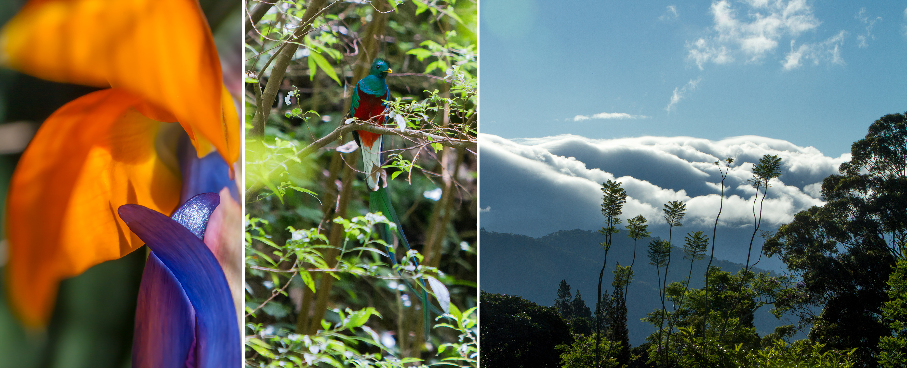
It is with great pleasure that I anticipate you something of this beautiful project in Boquete, Chiriqui. For those who do not know Boquete, it is a town located in the highlands of Chiriqui, surrounded by coffee plantations, rivers and mountains including the famous Baru volcano. Due to its high altitude, it has a privileged climate, which results in a lush and colorful vegetation like an eternal spring. Last year I visited this place with my family, walking incredible trails, surrounded by ferns of all kinds and huge trees. To our good fortune, we saw a Quetzal dancing and singing.
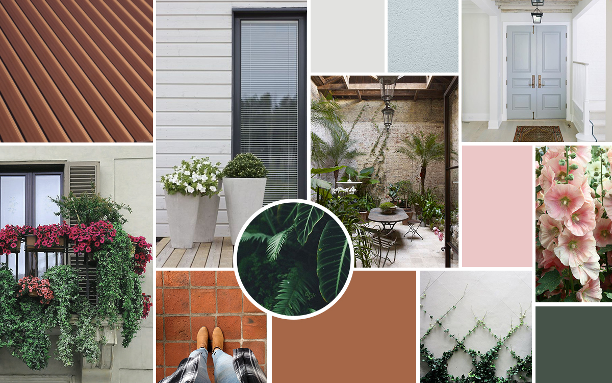
It's not every day that great opportunities arrive at your door, but when they do, you have to take them with all the love and value they deserve. This project is great, not only because of the beautiful location; but also because it is a collaborative project with Panamanian architect Xiomara Armijo (Ekis Arquitectos), so by joining talents, the result will surely be successful. In addition, our client has a very pro-active vision towards Boquete and the project, wishing to rescue and highlight an identity that is being lost in the town at the architectural level, valuing “quality over quantity”.
SITE ANALYSIS
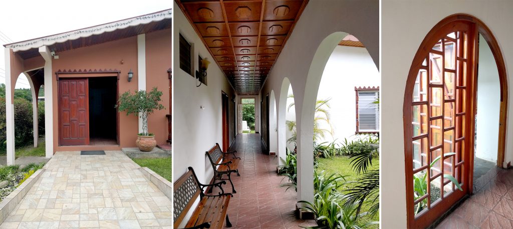
Currently, the Rebequet Hotel, the client's family business, is located on the property. It was designed and built by her father in the early eighties. It has nine rooms and a very nice internal courtyard, designed with arches in the perimeter corridor. The wooden ceiling and ornamental details make it very original.
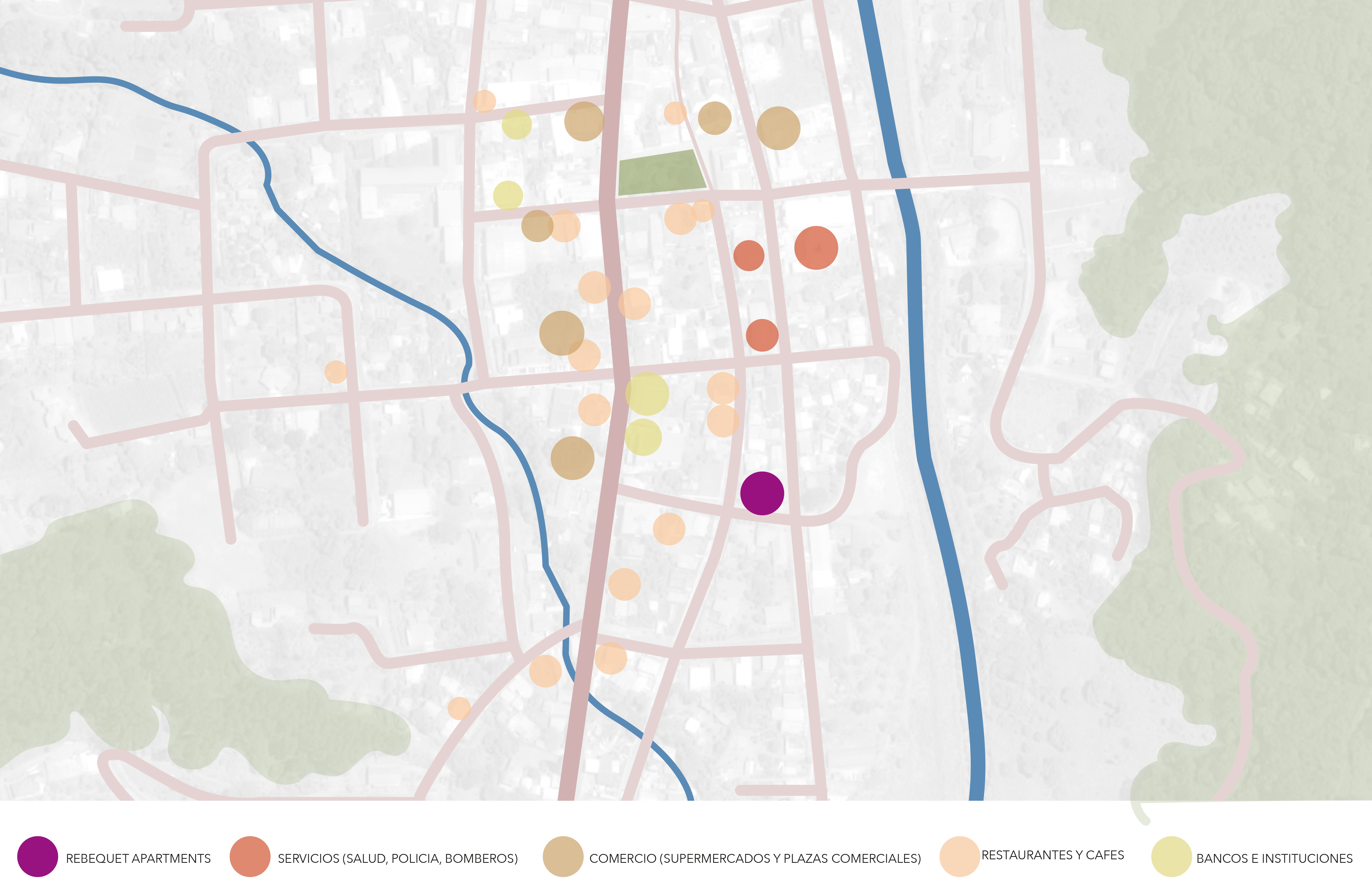
Boquete is a very touristic area and over the years many hotels and hostels have appeared, making the market more competitive, consequently the hotel is difficult to maintain. The client looked to us for innovation in order to preserve her family business and update her property according to the current demand. Currently in town there is a large number of foreigners, mostly North Americans and Canadians. As well as a growing demand for apartments for people of different ages, either to buy or rent short or long term. An analysis of the site alternatives was carried out, evaluating standards and budget. The first option was to maintain the existing building, adapting the existing rooms to complete apartments (with kitchen, living room, etc.). The second option was to maintain the existing building and grow in height one more level, with the same principles as above. The third option was to demolish the existing building and build a new one with three levels. After discussing the options with the client and comparing several aspects, the decision was made to execute the third option.
CONTEXT
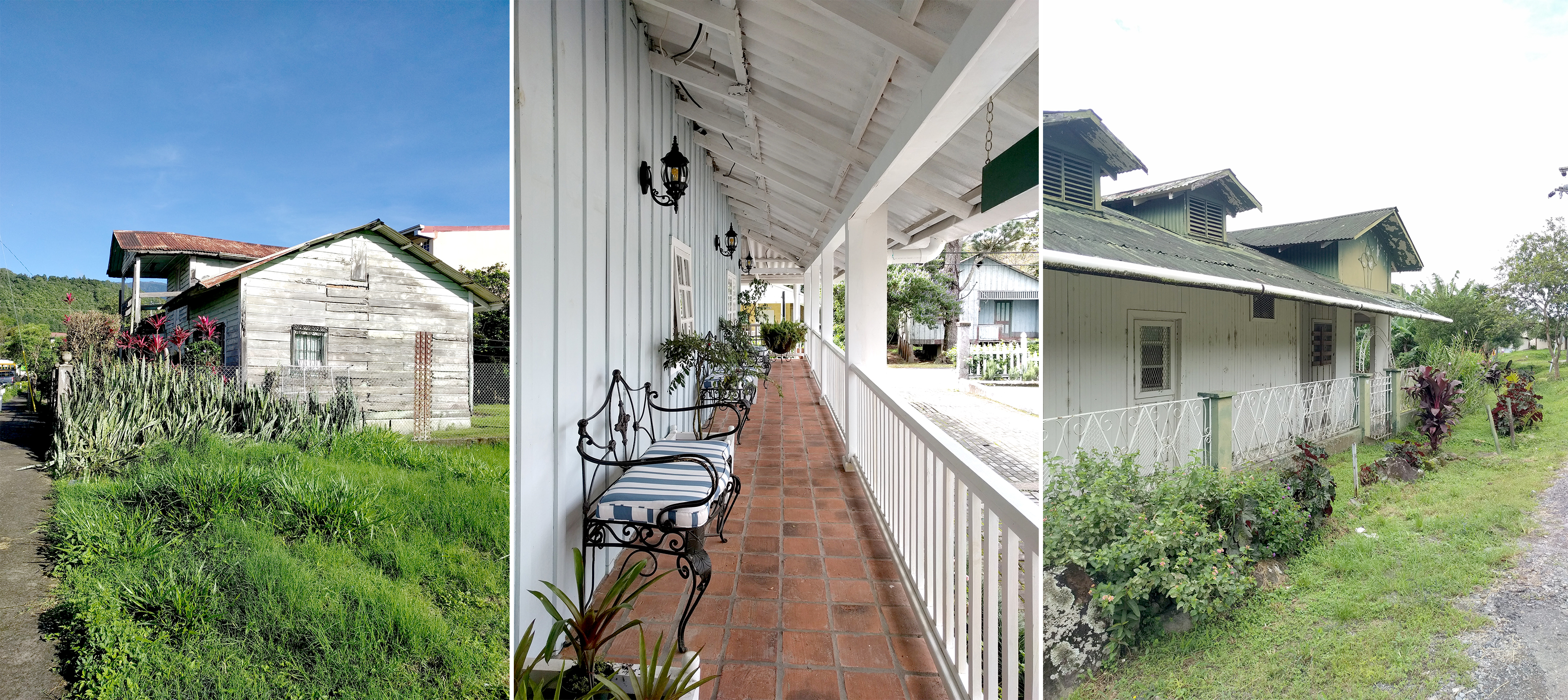
The village features old houses in a mountain style with gabled roofs, built with wood, terracotta floors, French windows and porches front. A beautiful and particular style that the client wants to rescue. Taking into consideration the goodness of Rebequet's original design, added to this beautiful and cozy architecture, we are designing the new project. It will consist of a three-story residential building. In total there will be thirteen apartments of different sizes. Most of them will be small, with one or two bedrooms, one bathroom, open kitchen and integrated laundry.
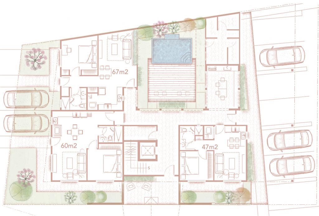
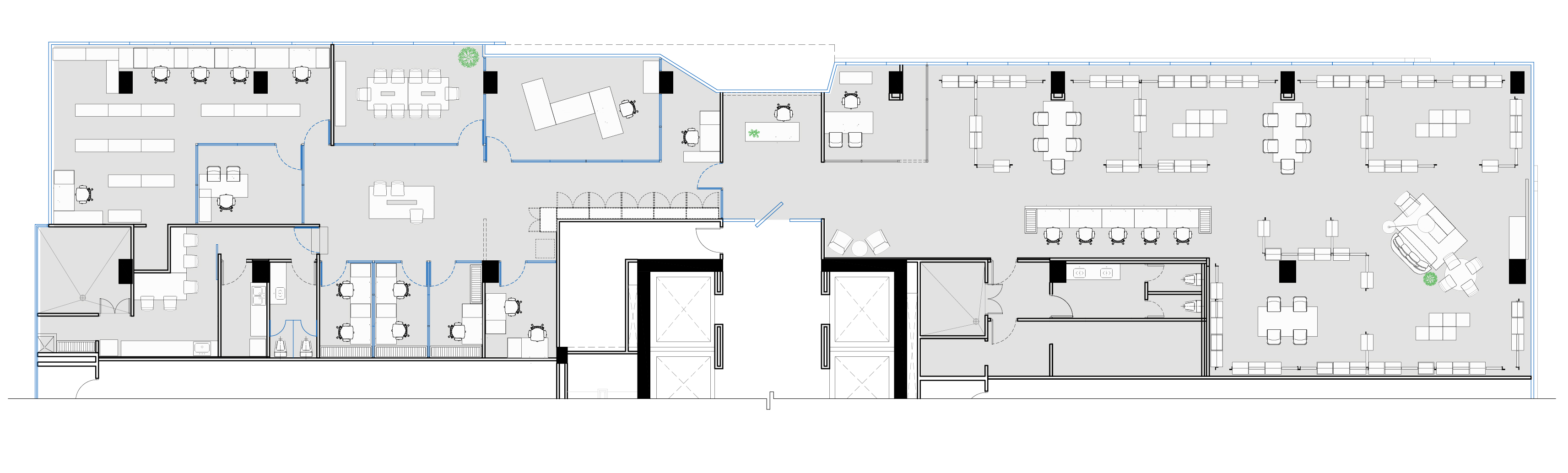
GROUND FLOOR
At street level there are two entrances. A main one from a garage door (necessary for Boquete's abundant rain), which will feature an inviting space to sit and wait or converse, with a backdrop of ivy climbing up the façade to the second level. Upon access, there is a small lobby, vertical circulation of stairs and elevator, where you can go up to the upper floors or enter with a view of a vertical self-supporting “green” element that breathes and anticipates the internal courtyard. Once you enter the semi-open corridor which is embraced by arches inspired by the existing internal courtyard at Rebequet, you can already visualize the internal courtyard, which will have even more greenery and beautiful flowers. In the center of the courtyard, a wooden deck and a small pool. Next to the patio, an open covered terrace with a long picnic table for barbecues. This space is adjacent to the outside circulation area and the parking lot, however a semi-open enclosure and a planter buffer the view and noise.
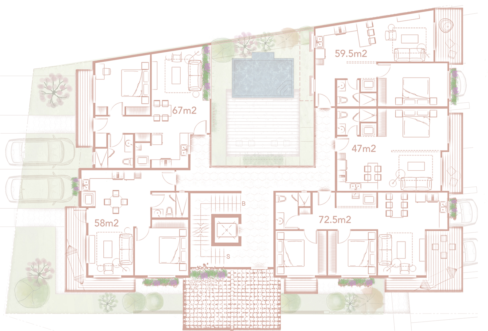
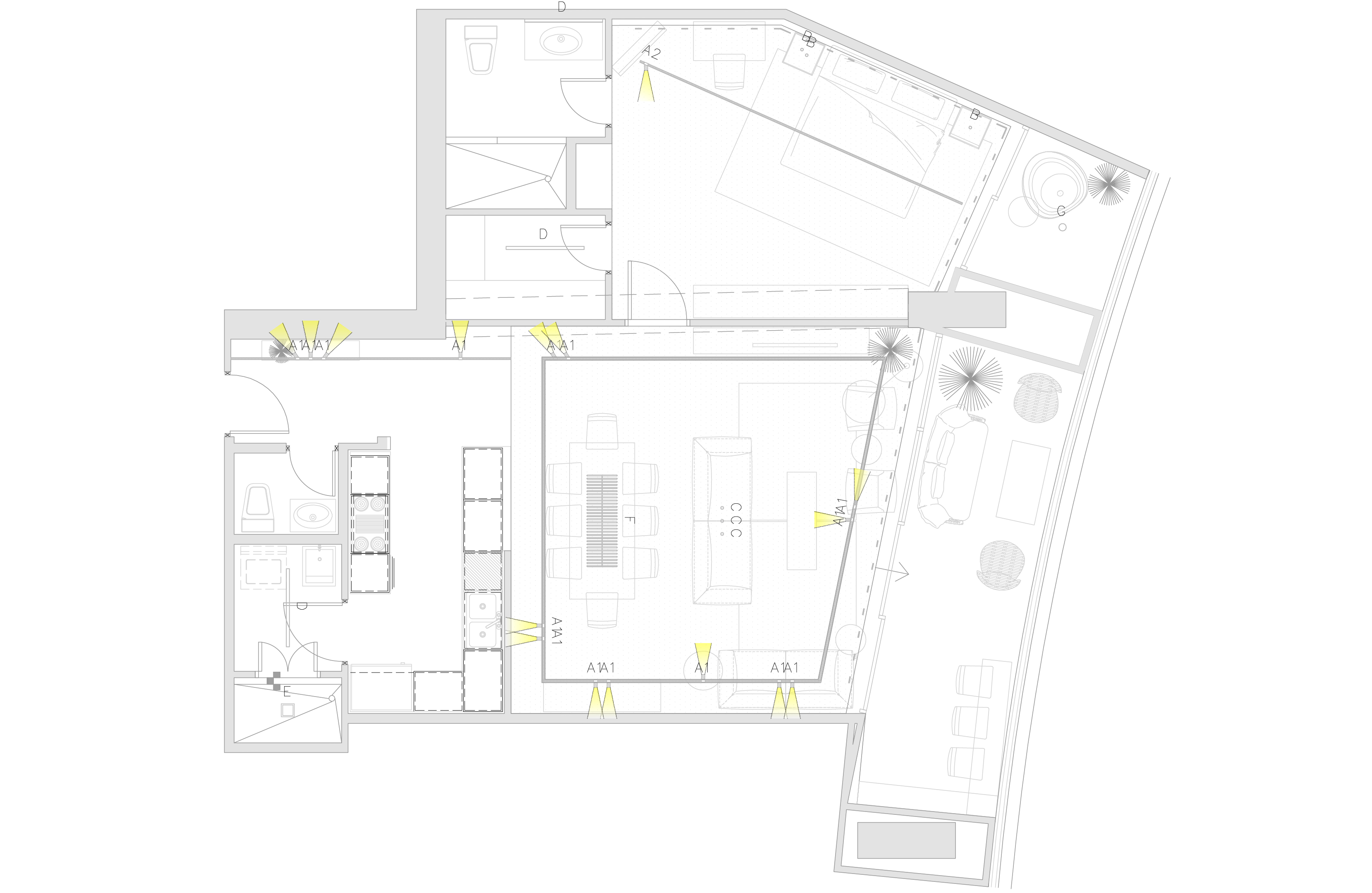
LEVEL 2 FLOOR
Both upper floors have five apartments, each with particular characteristics. All of them are accessed from the internal perimeter corridor that leads to the internal courtyard. All apartments have terraces and balconies with planters to enjoy the views of Boquete and the cool climate. On the second floor, there is a large communal terrace facing the main facade, as a second social area, enjoying the view.
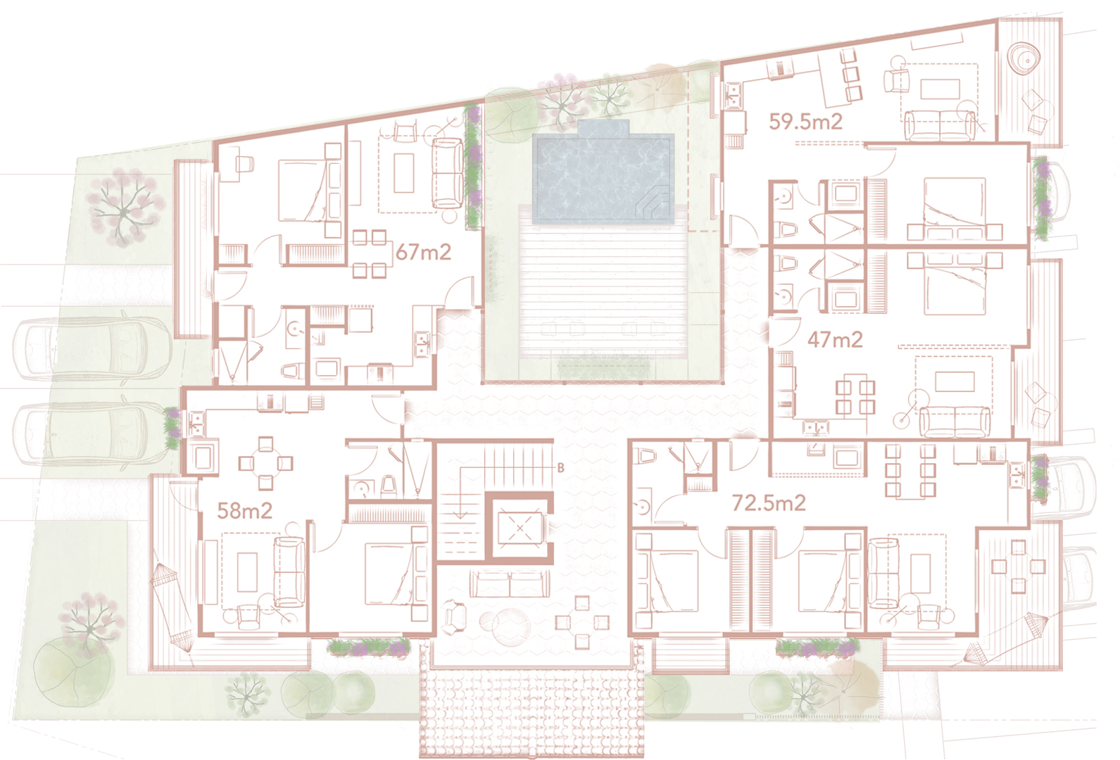
LEVEL 3 FLOOR
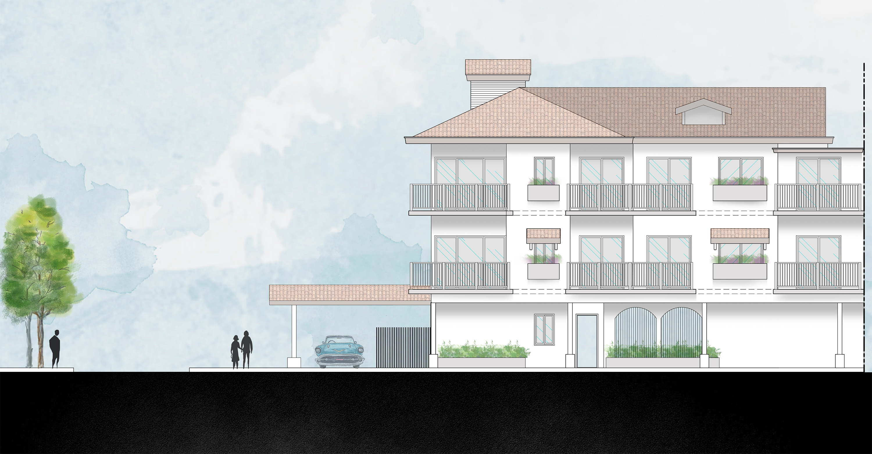
EAST ELEVATION
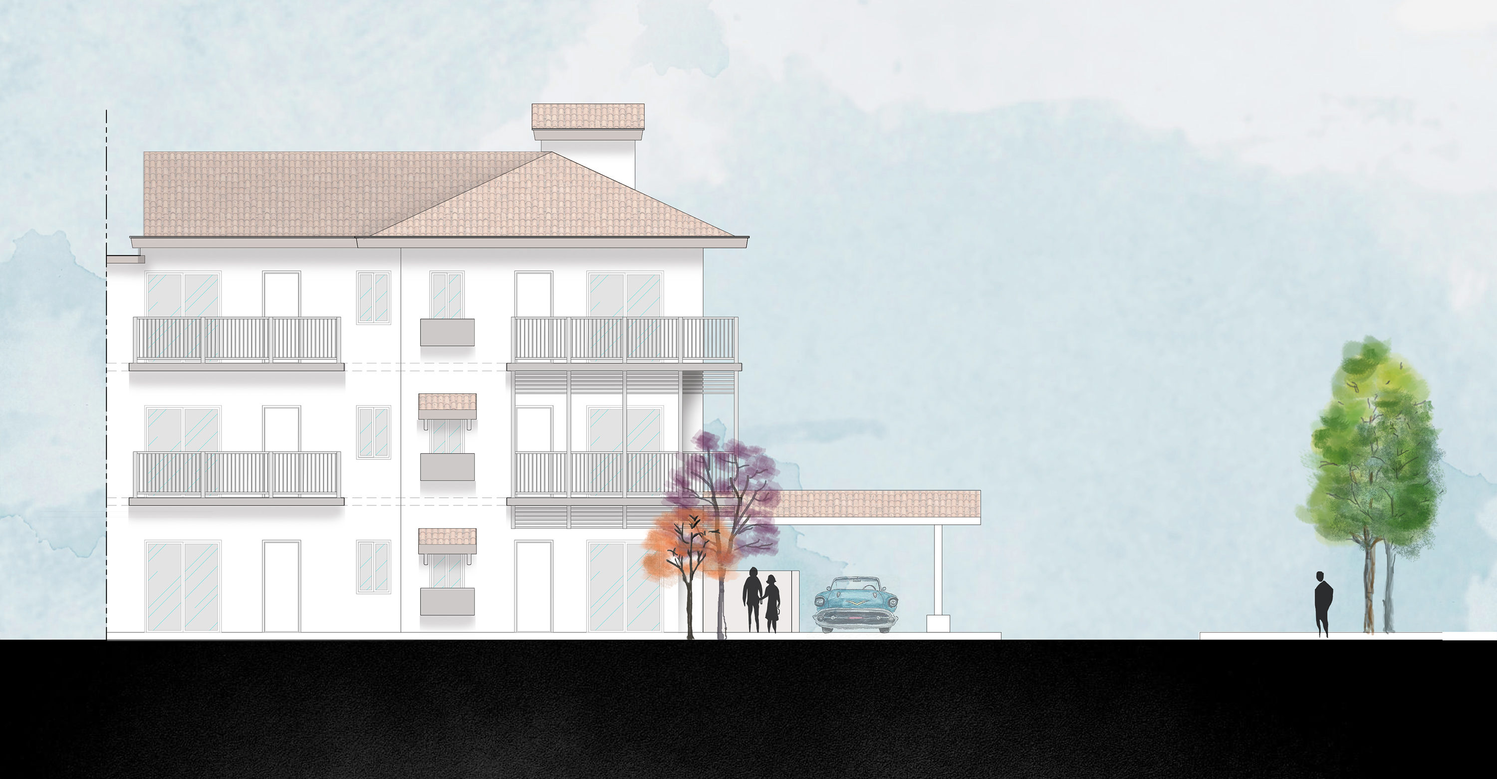
WEST ELEVATION
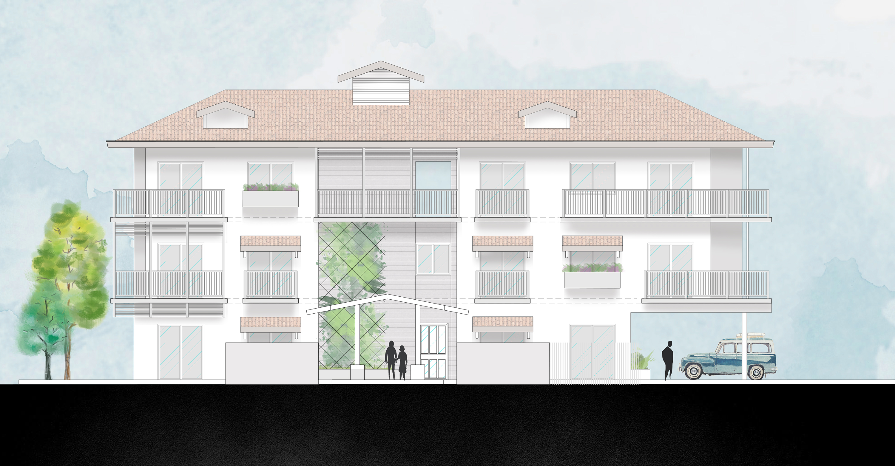
SOUTH ELEVATION
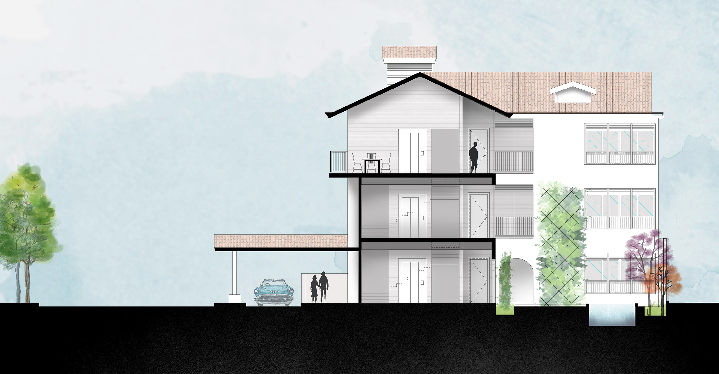
CROSS SECTION 1
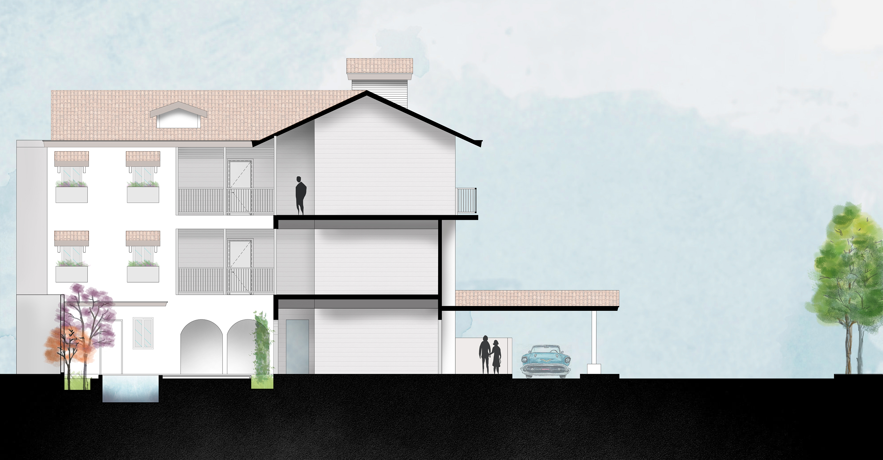
CROSS SECTION 2
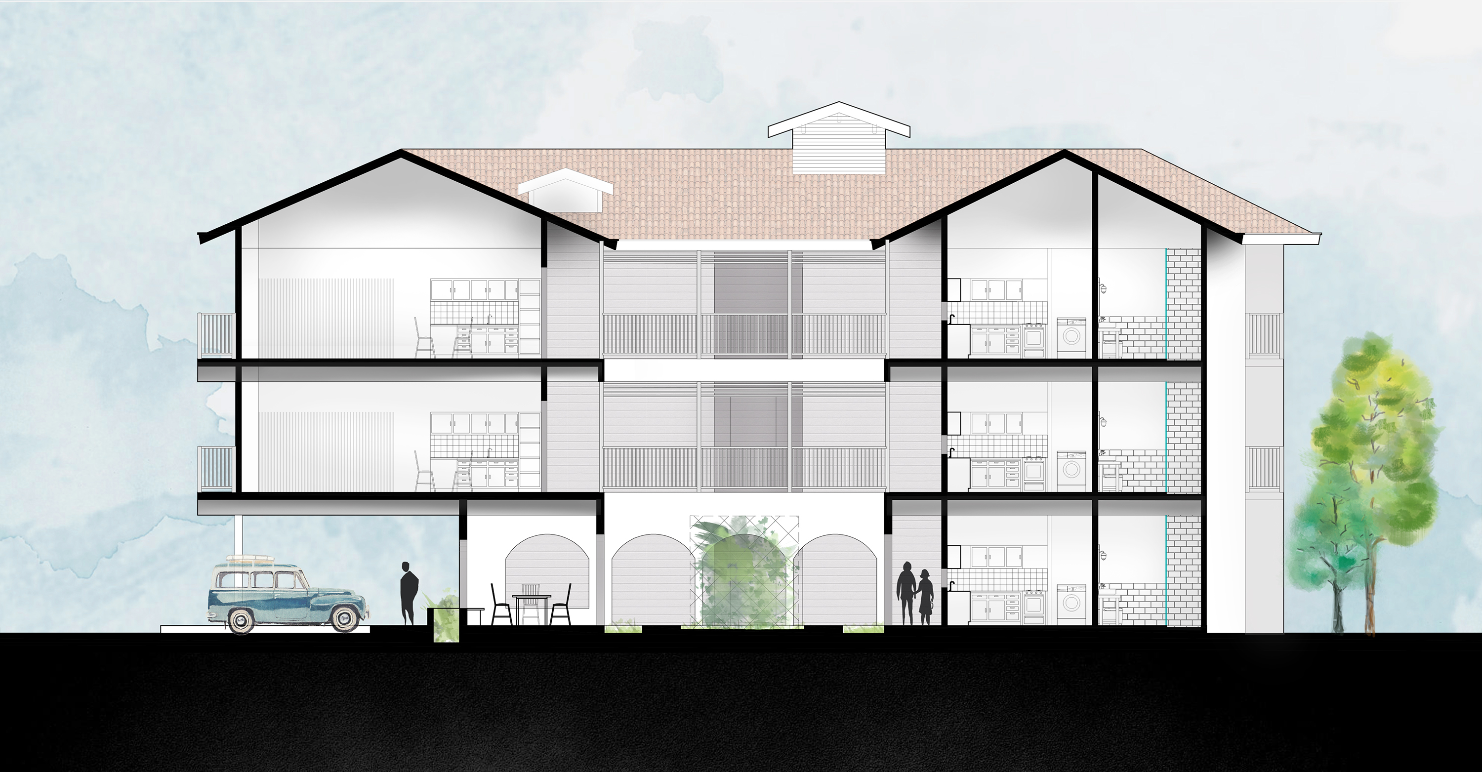
LONGITUDINAL SECTION
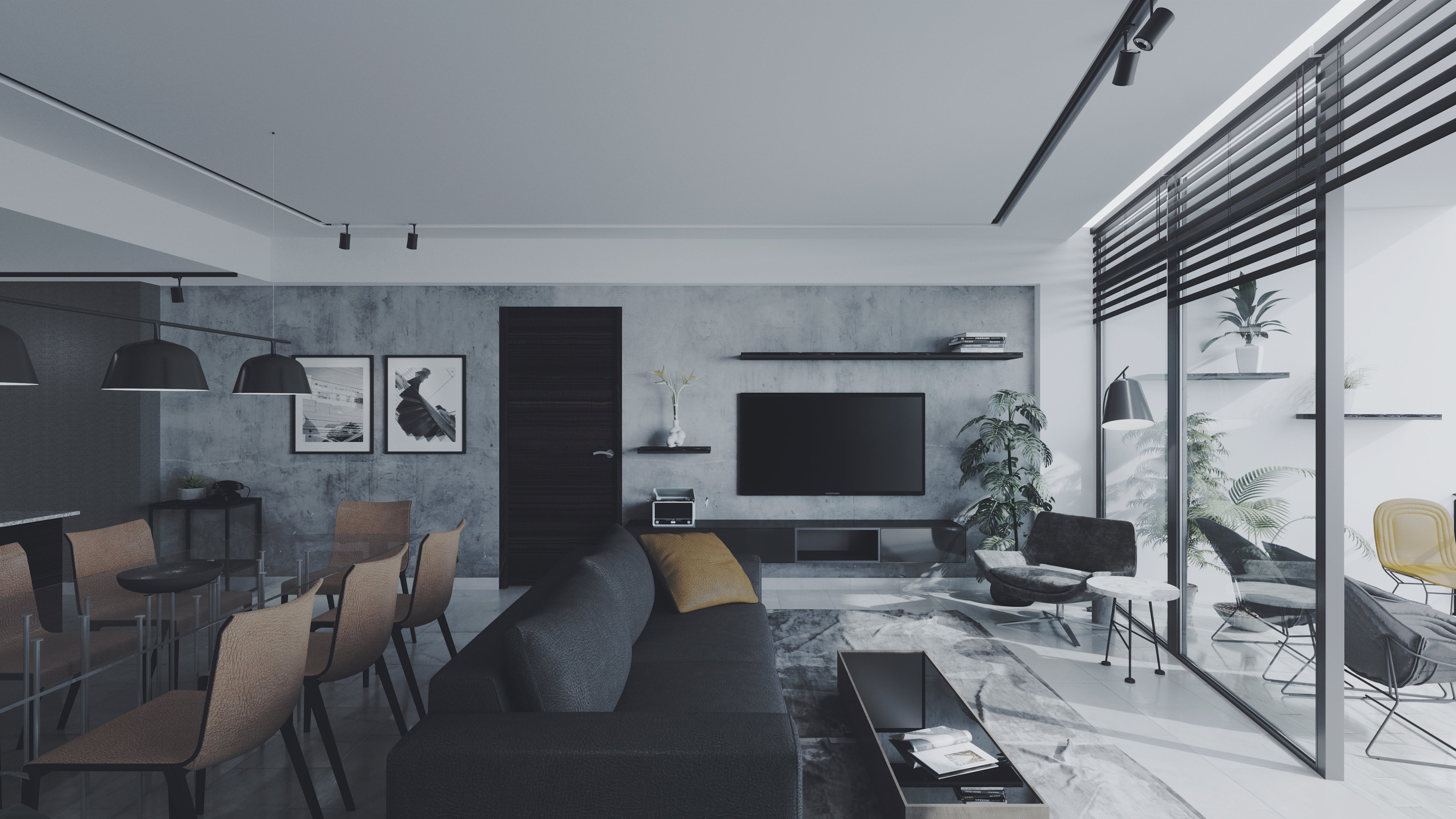
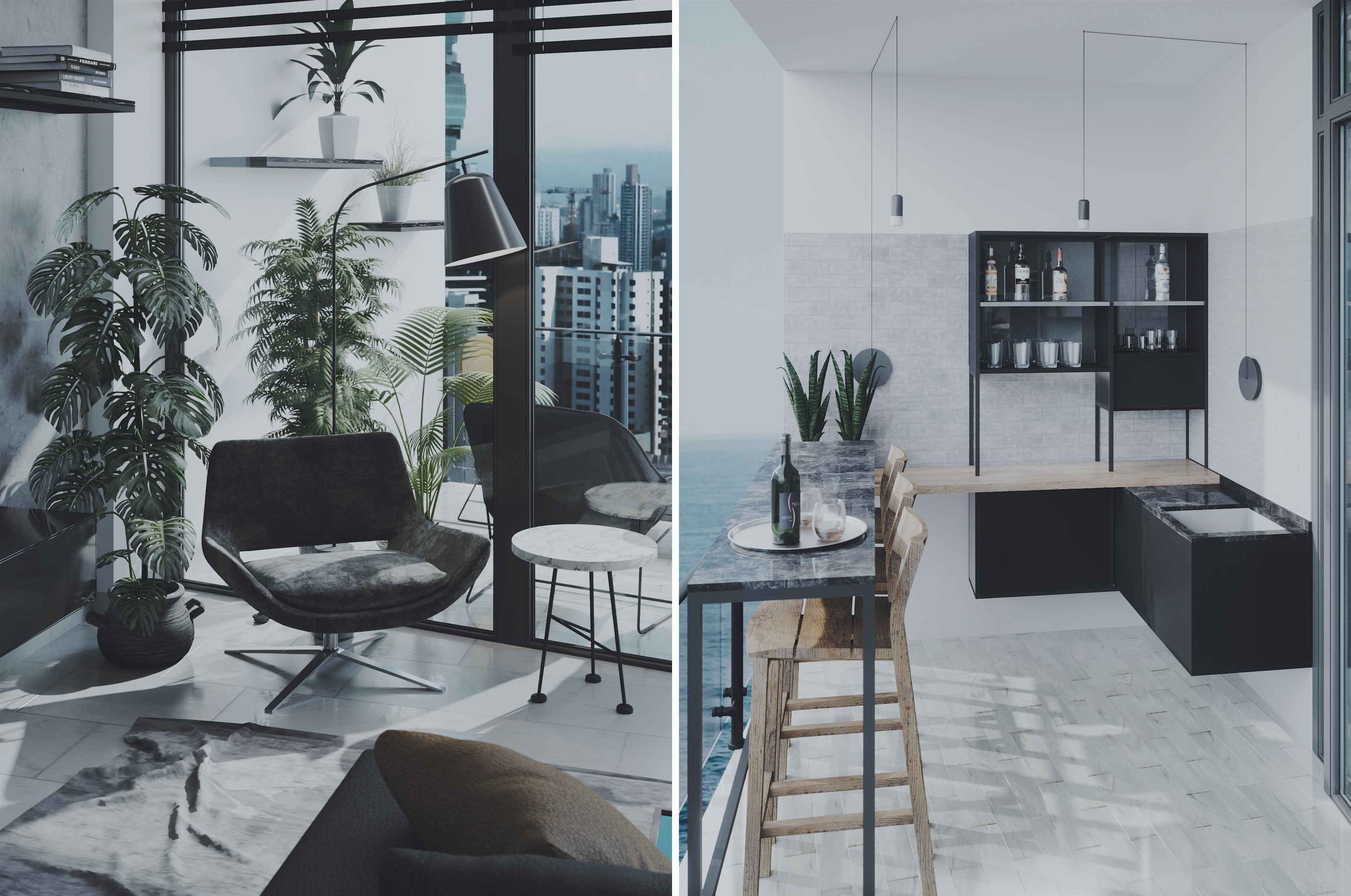
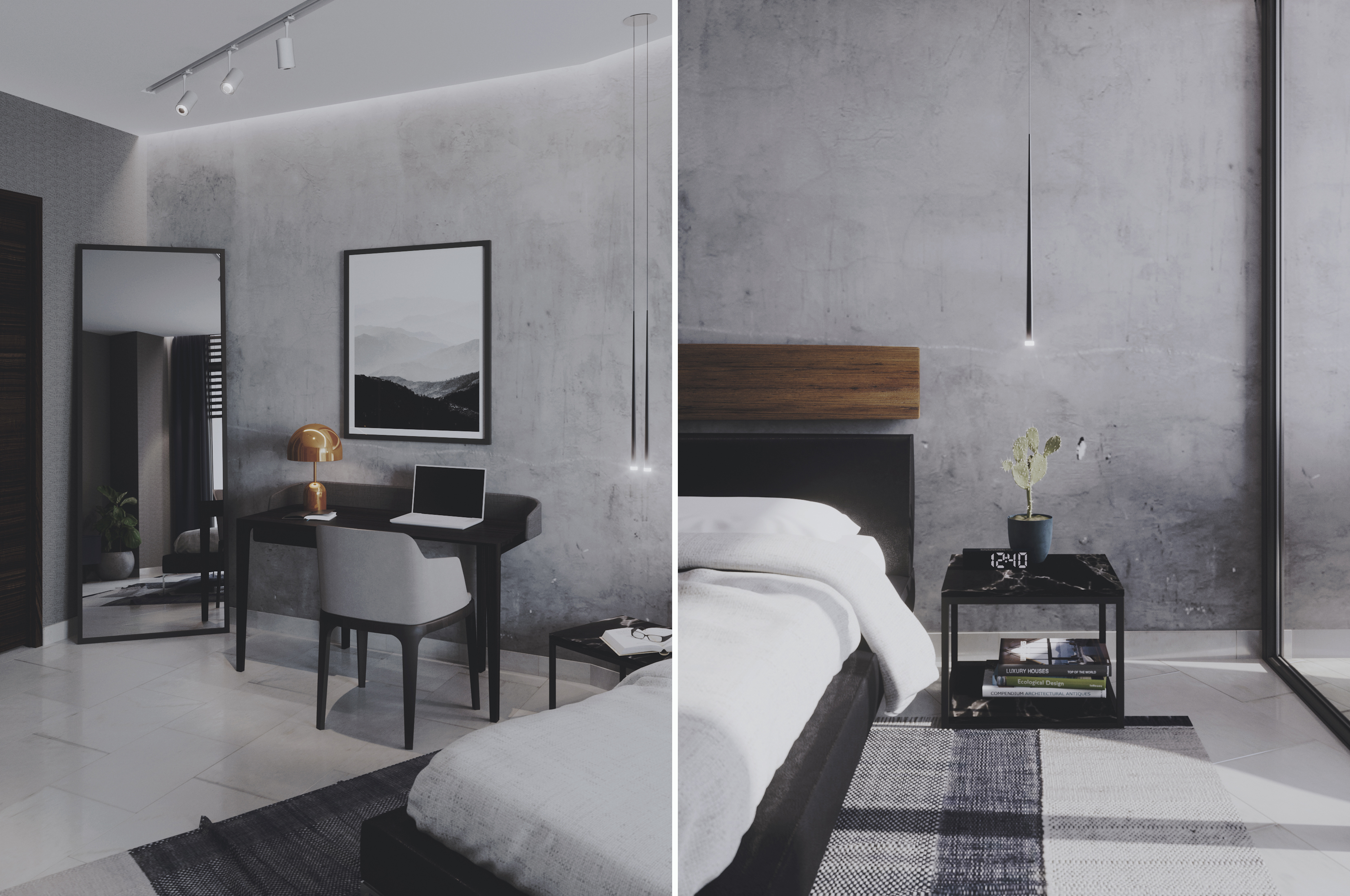
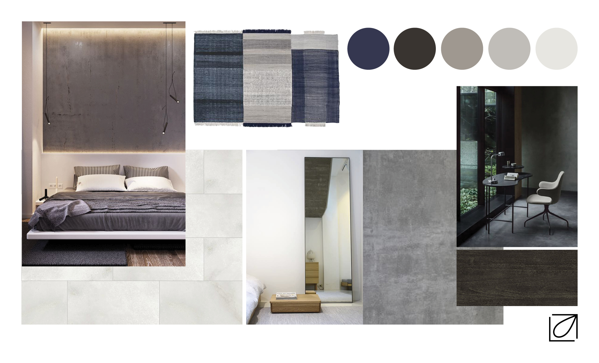 The bedroom follows the same style as the living room, only using blue as an accent color. The room has a king size bed with bedside tables and a TV console in front of it. It also has a desk and a full length mirror leaning in the corner.
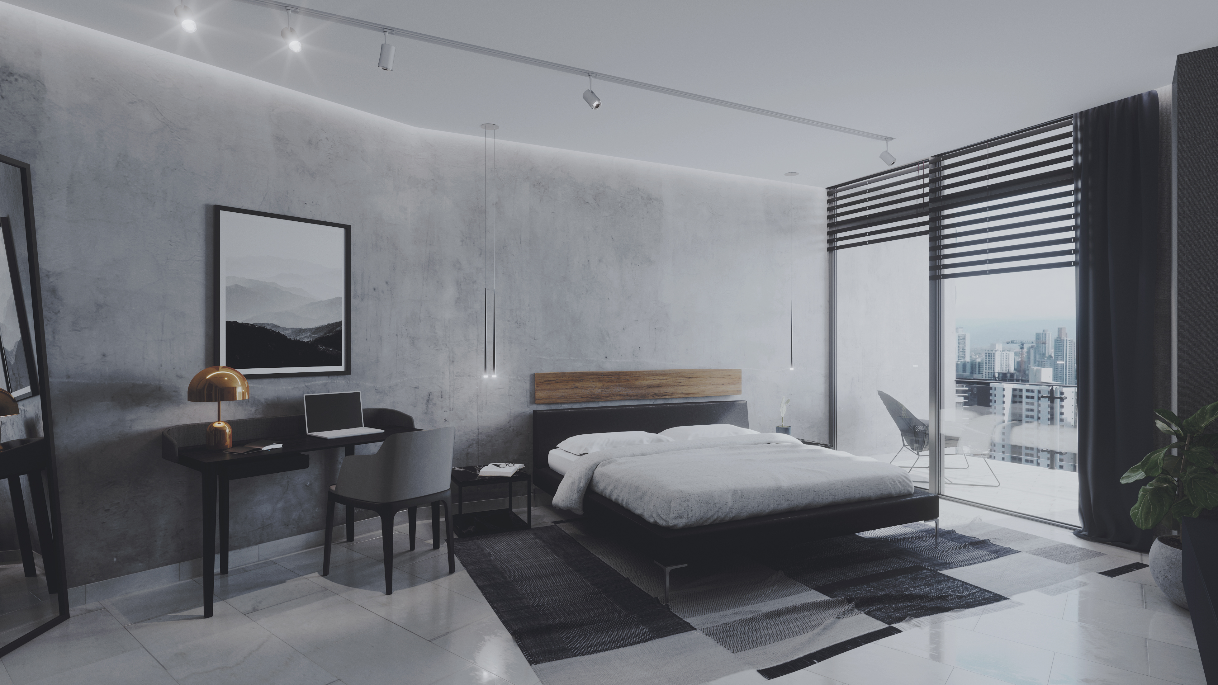
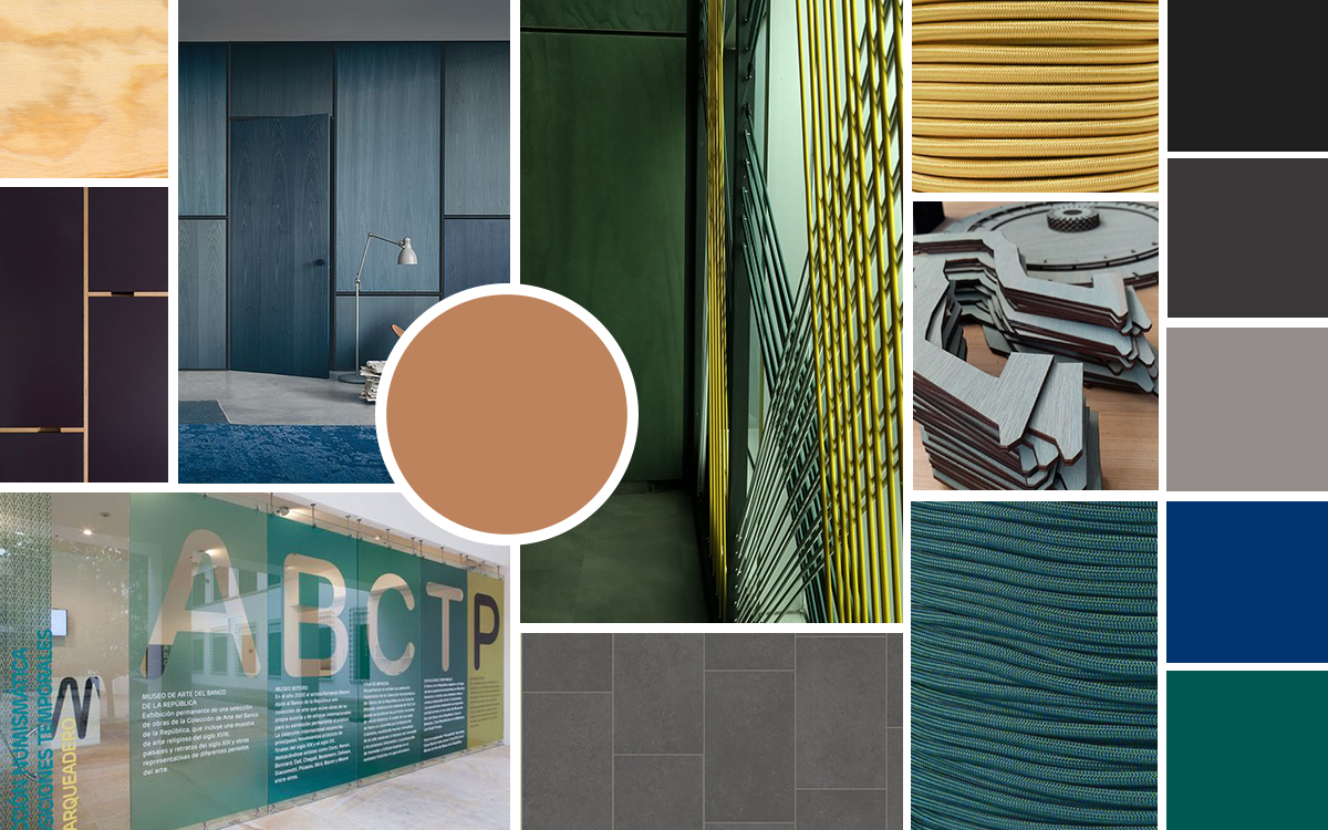
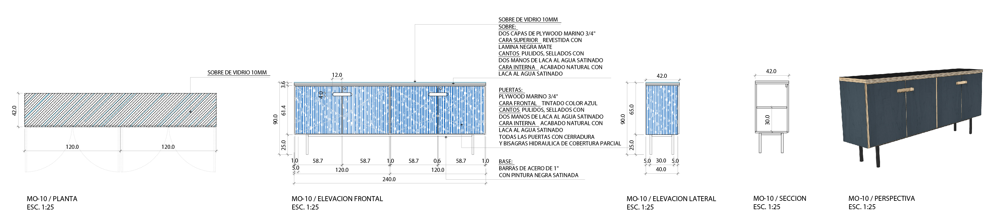
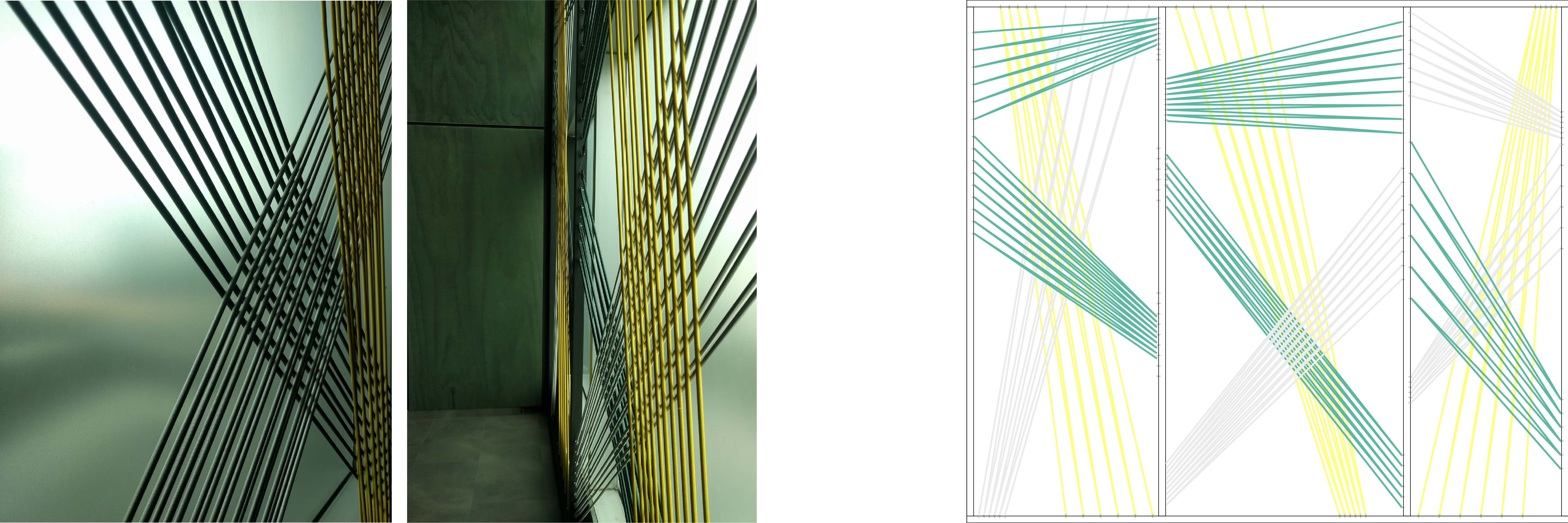
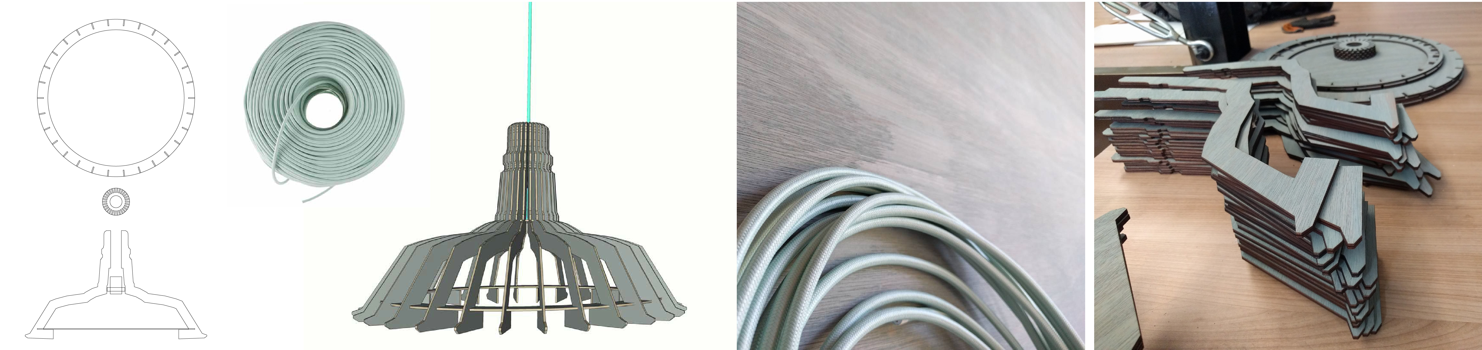
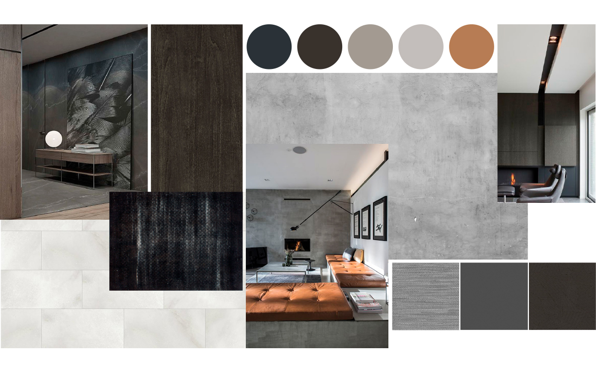
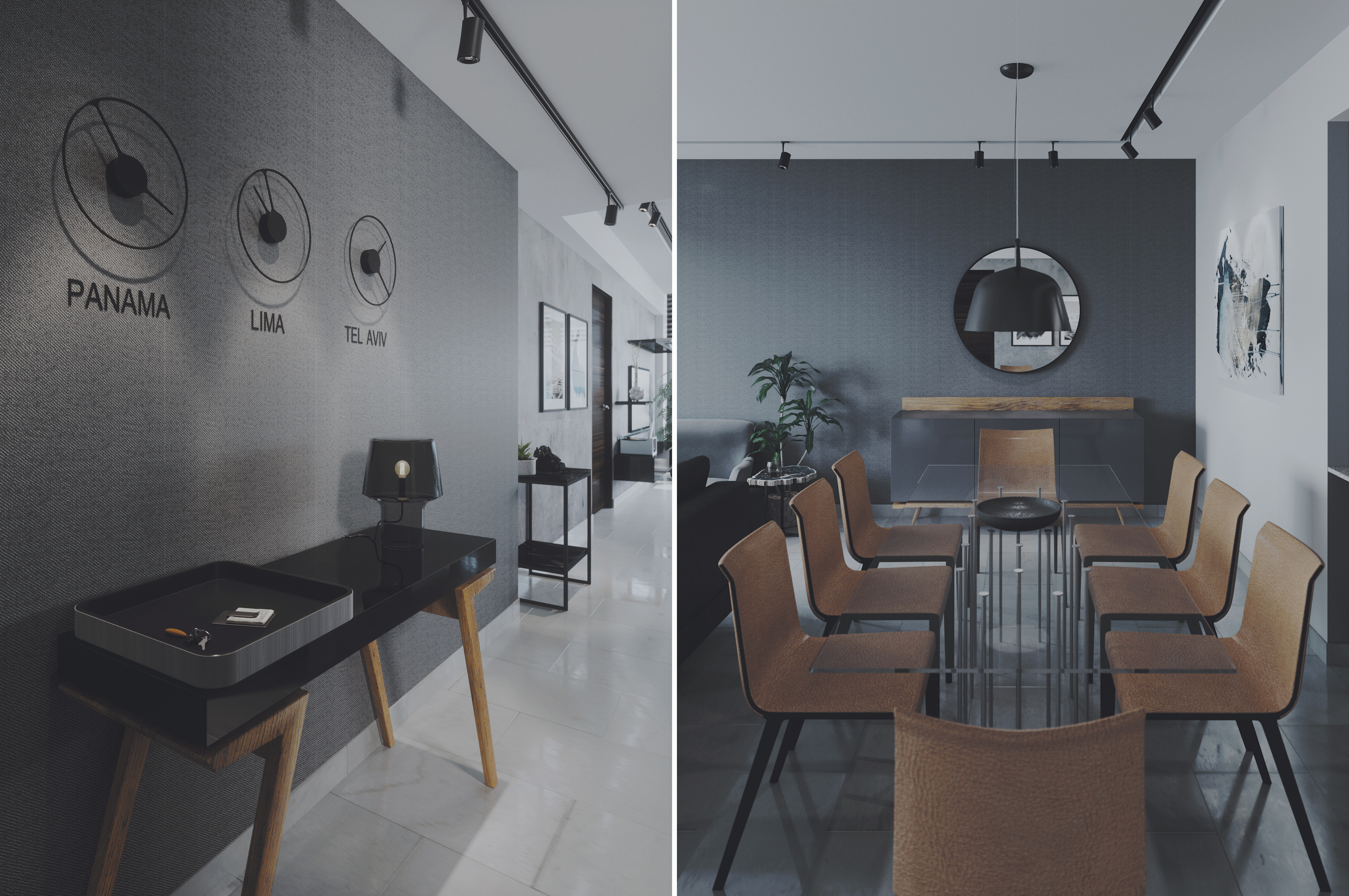
 In the search for low-budget materials, we found chipboard and construction materials as possible elements. Among those materials, our favorite was marine plywood, which has pine tops and raw-striped edges that look great on office furniture. It is an inexpensive material that doesn't need a lot of finishing to look good, and many of the furniture pieces were designed in this material with envelopes that were more touchable and handled with black plastic laminate (formica). We looked at different types of flooring that would not mean demolishing the existing floor and opted to use a high traffic vinyl floor that is installed in a tongue and groove fashion, which because it has no glue is easy to carry in view of a future move. In addition, we saw the opportunity to make our own installations that would not be expensive for the client but that would bring design and personality to the environment, in these installations we included colorful strings in the reception and offices, also lamps designed and manufactured by us.